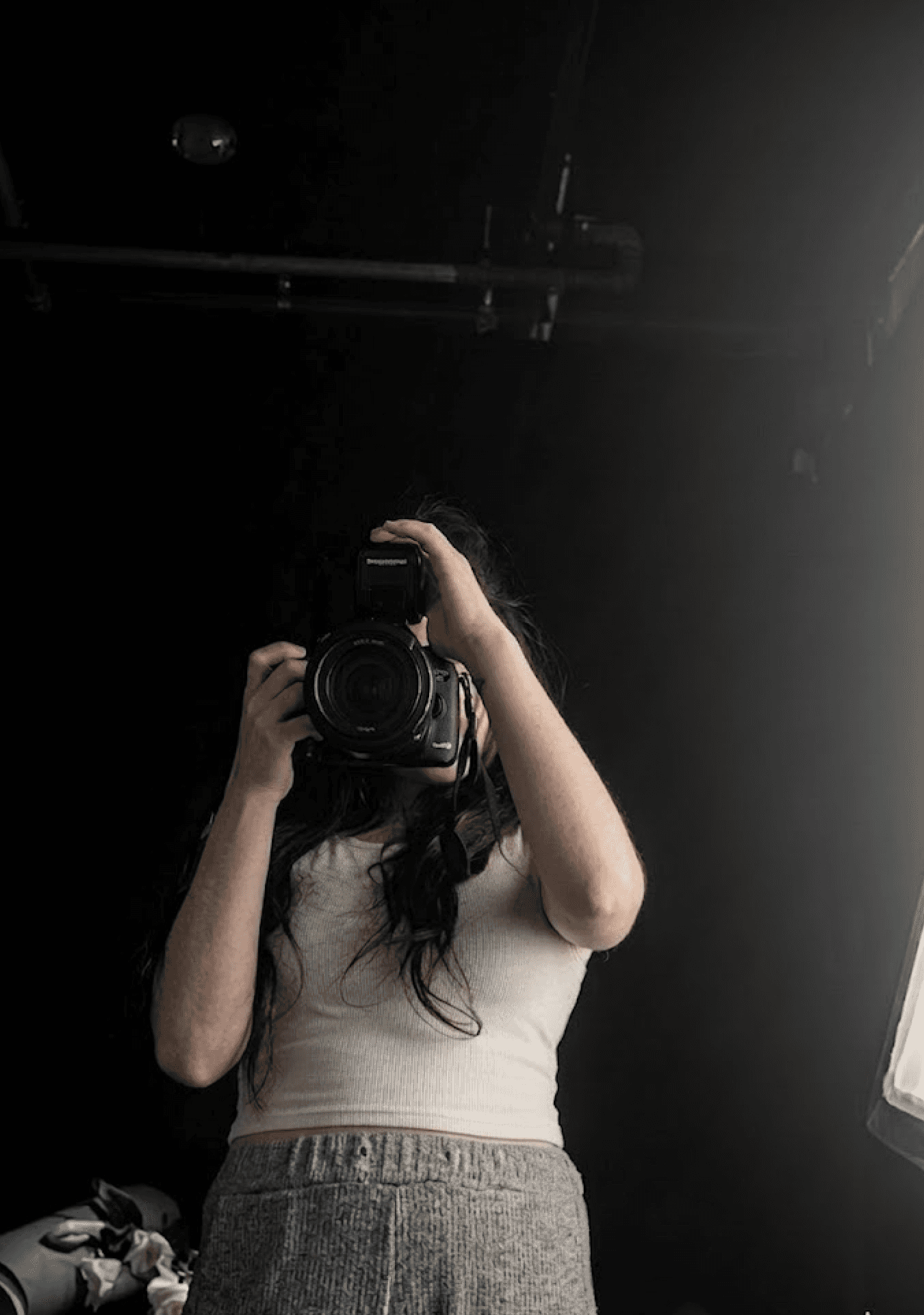
Hi, I am Yena, Designing experiences that make brands impossible to ignore.
Hi, I am Yena, Designing experiences that make brands impossible to ignore.
Hi, I am Yena, Designing experiences that make brands impossible to ignore.
Designer specializing in branding, web, and motion. Been designing since noticing things nobody else cared about. Grew up. The obsession didn't. Now turning that into experiences people love.

Delivered across formats.
to visual story
From insight
Disruptive Sophistication
01 — Aesthetic
I look for a balance between timeless refinement and a sense of freshness that still moves people. The work should feel minimal, clear, and composed, but never flat. I am most interested in the point where restraint meets surprise, and where sophistication still leaves room for feeling.
Disruptive Sophistication
01 — Aesthetic
I Like Work That Feels Minimal But Alive with human craftmanship — Restraint With A Twist. I pursue Disruptive Sophistication, which Means Clean Structure, Sharp Contrast, And An Emotional Spark That Doesn’t Need Extra Decoration.
Flexible Systems
02 — Method
To me, a good system should give the work direction without locking it in place. I build visual structures that create consistency and reuse, but still leave space for creative judgment, flexibility, and variation.
Flexible Systems
02 — Method
To me, a good system should give the work direction without locking it in place. I build visual structures that create consistency and reuse, but still leave space for creative judgment, flexibility, and variation.
Flexible Systems
02 — Method
To me, a good system should give the work direction without locking it in place. I build visual structures that create consistency and reuse, but still leave space for creative judgment, flexibility, and variation.
VISUAL RESEARCH
TECHNOLOGY WITH CRAFTMANSHIP
Yena Jang
Visual Research —
Visual Research©
Visual Research —
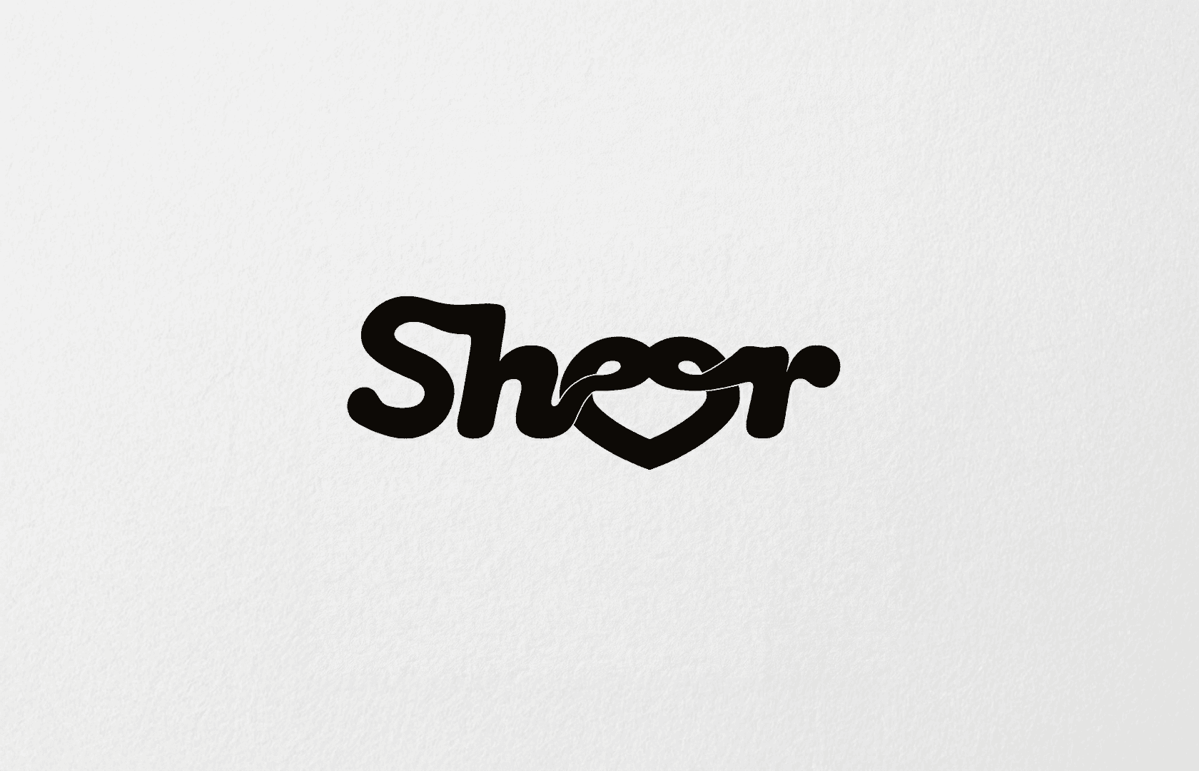
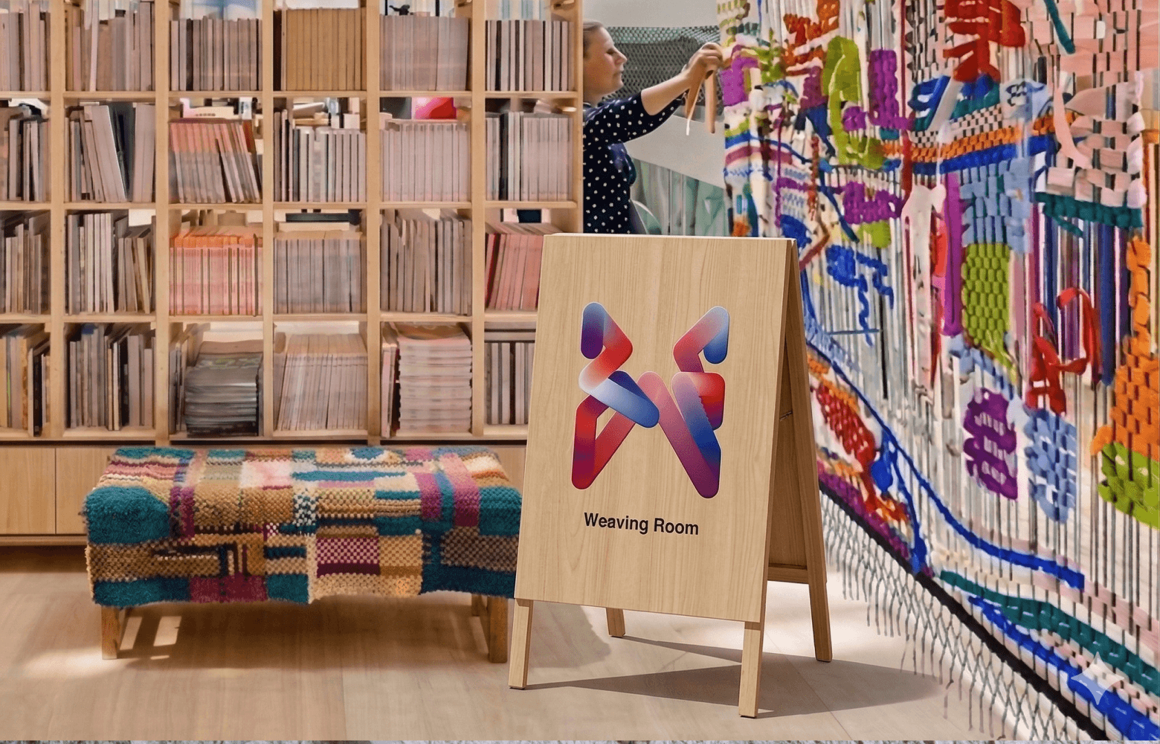
Sheer
Local Brand Identity Design
Sheer is a local weaving craft community to promote the connection of international women in The Hague with the power of soft values of crafts.
Sheer
Local Brand Identity Design
Sheer is a local weaving craft community to promote the connection of international women in The Hague with the power of soft values of crafts.
Sheer
Local Brand Identity Design
Sheer is a local weaving craft community to promote the connection of international women in The Hague with the power of soft values of crafts.

Dot, Line, Letter
Type Design
Built from dots and lines, this type specimen treats typography as a modular system. The project explores how a limited set of elements can generate structured and experimental letterforms as a process of assembly.
Dot, Line, Letter
Type Design
Built from dots and lines, this type specimen treats typography as a modular system. The project explores how a limited set of elements can generate structured and experimental letterforms as a process of assembly.
Dot, Line, Letter
Type Design
Built from dots and lines, this type specimen treats typography as a modular system. The project explores how a limited set of elements can generate structured and experimental letterforms as a process of assembly.

EX-MOTION
Virtual Space Branding in Unity
During the Covid, the pandemic was not just only swipped out our physical health but also mental health. "Ex-motion" is a virtual space where people can let out their covid emotions with 3 emotional languages: Anger, Depression, Anxiety.
EX-MOTION
Virtual Space Branding in Unity
During the Covid, the pandemic was not just only swipped out our physical health but also mental health. "Ex-motion" is a virtual space where people can let out their covid emotions with 3 emotional languages: Anger, Depression, Anxiety.
EX-MOTION
Virtual Space Branding in Unity
During the Covid, the pandemic was not just only swipped out our physical health but also mental health. "Ex-motion" is a virtual space where people can let out their covid emotions with 3 emotional languages: Anger, Depression, Anxiety.


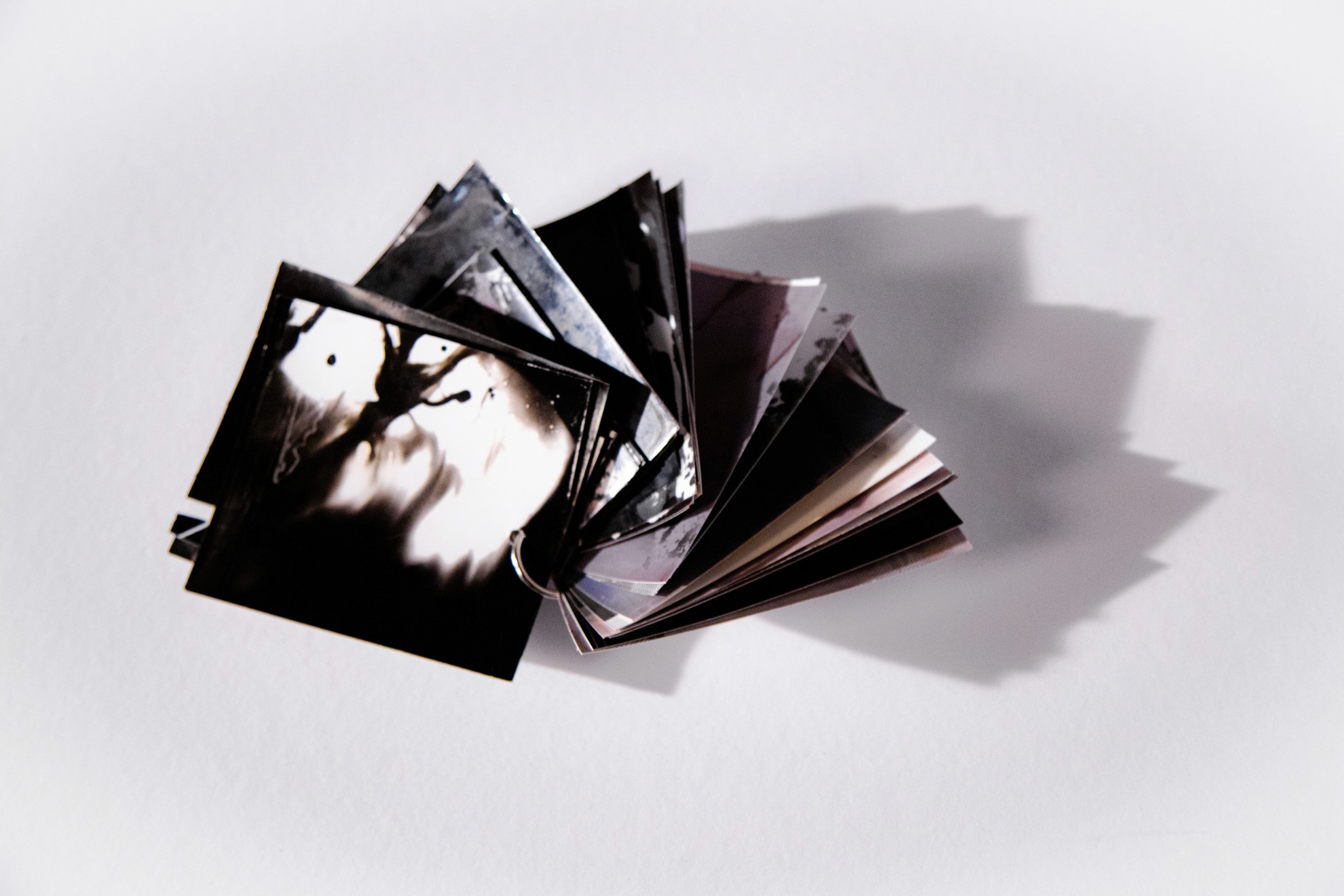
Reclaiming the Erotic
Editorial Design / Spatial Publication Experience
Inspired by Audre Lorde’s essay Uses of the Erotic: The Erotic as Power, this publication explores the erotic as a source of inner power, self-recognition, and emotional depth. Designed beyond the format of the book alone, the project shapes reading as an immersive tactile and spiritual experience. Through handcrafted paper made from interpretations of eroticism, it invites readers to experience the reclaimed erotic through text, material, and atmosphere.

Anagreen
Visual Research
This project explores human understanding as plural rather than singular. By examining how the same object can be read differently depending on perception, it investigates how shifting visual order produces new meanings and gives rise to variant forms of language and symbol.

Woman at the Machine
Editorial Design / Curatorial Publication
Inspired by Karen Brodine’s life as a poet, feminist, and typesetter, this publication makes the invisible labor of typesetting visible. The book reveals the process behind lettersetting by showing typographic characters, spacing marks, pauses, line breaks, and quotation symbols before the finished text appears. In doing so, the project interprets Brodine’s political commitment to labor by turning the mechanics of composition itself into an editorial language.
Capabilities
Soft and Hard Skills
Yena Jang
Capabilities
Soft and Hard Skills
Capabilities
Capabilities
(3)
01
Insight & Facilitation
I define the problem from the perspective of the brand and its audience. Through structured communication with teams, stakeholders, and users, I distill inputs into insights and turn them into clear strategy, priorities, and design direction the team can execute.
02
Brand Identity System
I build brand language as an experience — not just a visual style. I define the brand’s tone and expression (atmosphere, attitude, pacing) and translate it into actionable guidance: typography, layout logic, imagery direction, and motion cues, documented so teams can apply it consistently.
03
Art Direction
I translate concepts into a clear visual tone across photography, motion, and film. I stay involved from ideation through production (planning, shooting, editing) to shape hero visuals for campaigns and case studies, and keep typography, imagery, and motion aligned to one direction.
04
Digital Brand Applications
I apply brand systems consistently across web, social, and digital touchpoints.I deliver production-ready assets for real launch contexts — with formats, crops, safe zones, and compression considered.
01
Insight & Facilitation
I define the problem from the perspective of the brand and its audience. Through structured communication with teams, stakeholders, and users, I distill inputs into insights and turn them into clear strategy, priorities, and design direction the team can execute.
Insight & Facilitation
I define the problem from the perspective of the brand and its audience. Through structured communication with teams, stakeholders, and users, I distill inputs into insights and turn them into clear strategy, priorities, and design direction the team can execute.
Insight & Facilitation
I define the problem from the perspective of the brand and its audience. Through structured communication with teams, stakeholders, and users, I distill inputs into insights and turn them into clear strategy, priorities, and design direction the team can execute.
02
Brand Identity System
I build brand language as an experience — not just a visual style. I define the brand’s tone and expression (atmosphere, attitude, pacing) and translate it into actionable guidance: typography, layout logic, imagery direction, and motion cues, documented so teams can apply it consistently.
03
Art Direction
I translate concepts into a clear visual tone across photography, motion, and film. I stay involved from ideation through production (planning, shooting, editing) to shape hero visuals for campaigns and case studies, and keep typography, imagery, and motion aligned to one direction.
Art Direction
I translate concepts into a clear visual tone across photography, motion, and film. I stay involved from ideation through production (planning, shooting, editing) to shape hero visuals for campaigns and case studies, and keep typography, imagery, and motion aligned to one direction.
Art Direction
I translate concepts into a clear visual tone across photography, motion, and film. I stay involved from ideation through production (planning, shooting, editing) to shape hero visuals for campaigns and case studies, and keep typography, imagery, and motion aligned to one direction.
04
Digital Brand Applications
I apply brand systems consistently across web, social, and digital touchpoints.I deliver production-ready assets for real launch contexts — with formats, crops, safe zones, and compression considered.
Digital Brand Applications
I apply brand systems consistently across web, social, and digital touchpoints.I deliver production-ready assets for real launch contexts — with formats, crops, safe zones, and compression considered.
Digital Brand Applications
I apply brand systems consistently across web, social, and digital touchpoints.I deliver production-ready assets for real launch contexts — with formats, crops, safe zones, and compression considered.


Contact
Like-minded people coming together
Yena Jang
Contact
Like-minded people
CONTACT
contact
(4)
Let's talk
I like work that feels minimal but alive with human craftmanship that can ignite people mind, restraint with a twist, sophisticated but disruptive. I believe a true designer can spark emotion that doesn’t need extra decoration to prove.
I like work that feels minimal but alive with human craftmanship that can ignite people mind, restraint with a twist, sophisticated but disruptive. I believe a true designer can spark emotion that doesn’t need extra decoration to prove.
